For my final major project (FMP) at university, I curated a typographic book that aims to visually communicate my personal struggles with dyslexia.
Dyslexia is a specific learning difficulty which primarily affects reading and writing skills. However, it does not only affect these skills. Dyslexia is actually about information processing. Dyslexic people may have difficulty processing and remembering information they see and hear, which can affect learning and the acquisition of literacy skills. Dyslexia can also impact on other areas such as organisational skills. Every person with dyslexia has their own symptoms and struggles, and have individual experiences that not all may share. Within my research I have found that there are many misconceptions of dyslexia including 80 percent of people thinking that dyslexia is linked to an intellectual disability, and that dyslexia can be cured. These misconceptions result in many people not taking dyslexia seriously, leaving 6 million people in the UK struggling with dyslexia undiagnosed.
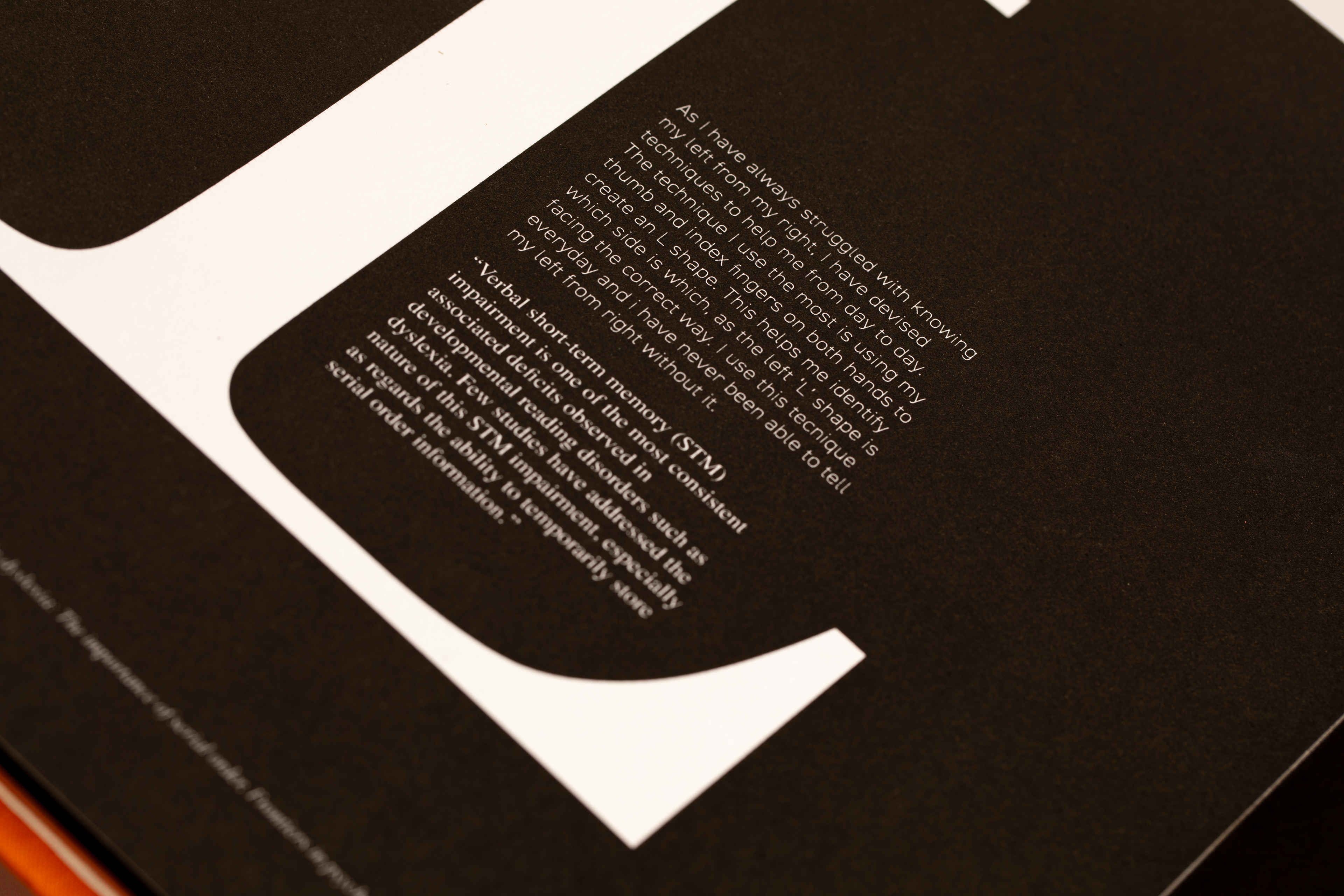
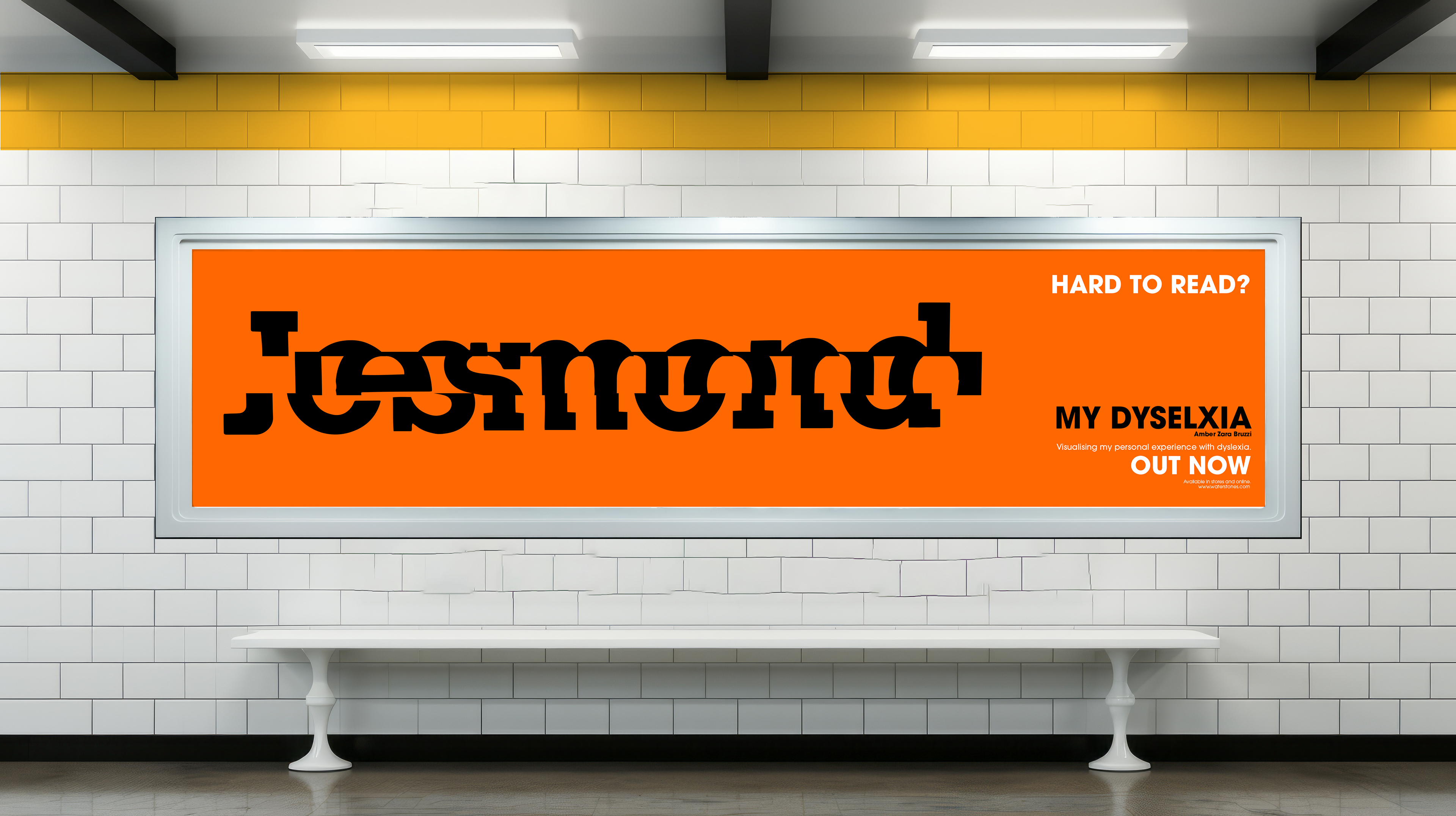
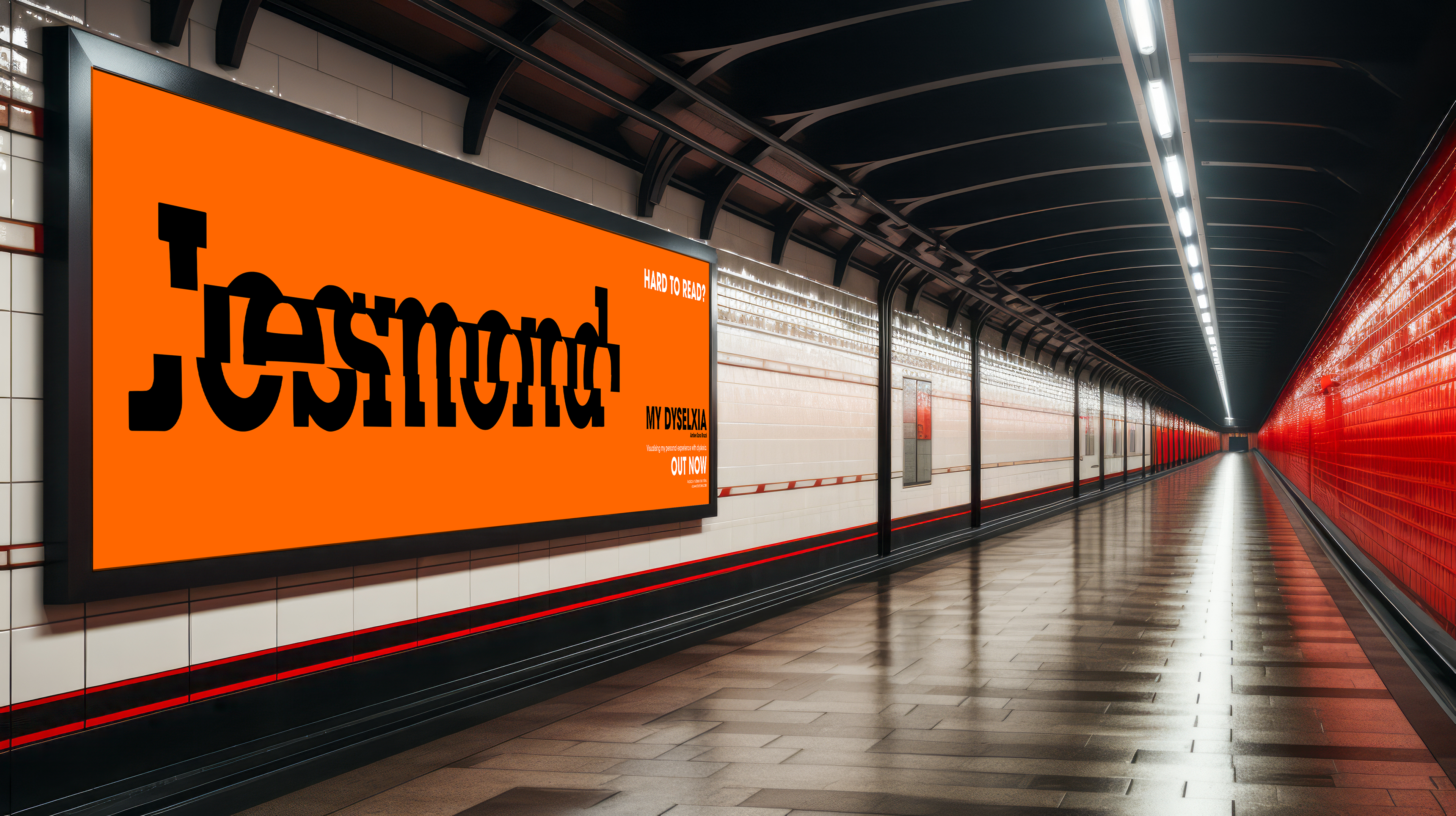
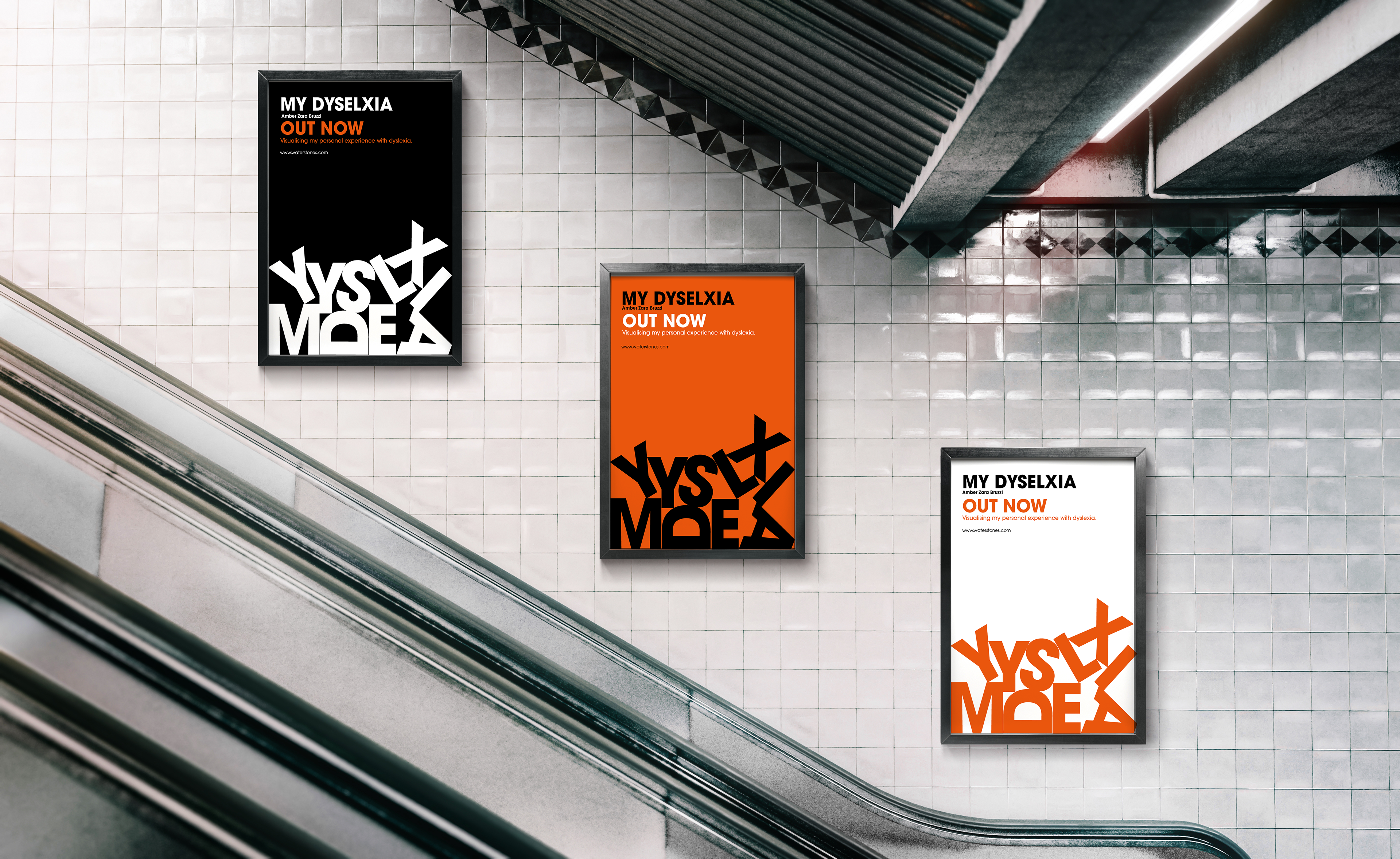
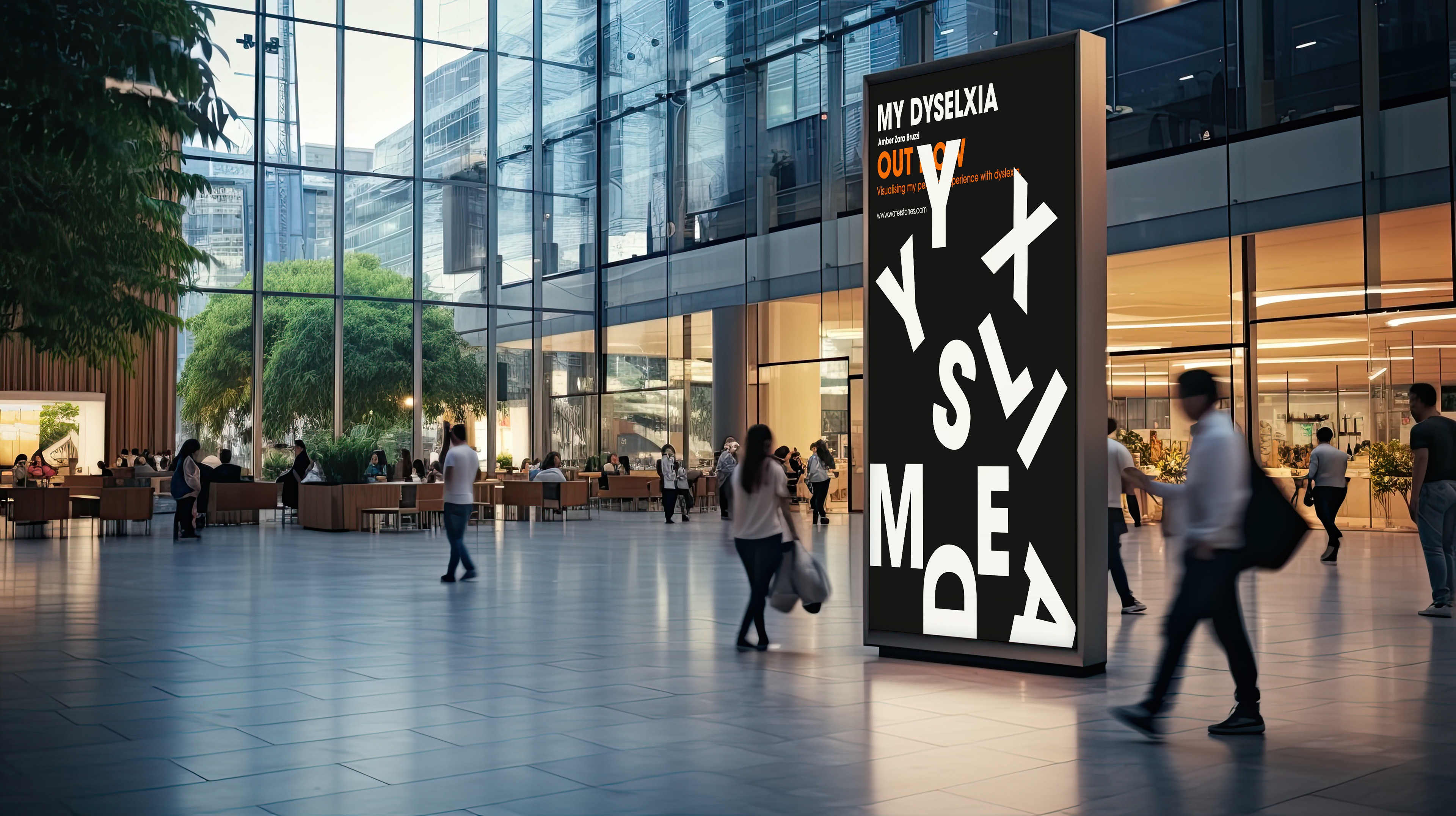
This book is aimed to visually communicate my personal struggles with dyslexia. People may not understand the types of difficulties that are faced every day, and hopefully this can encourage people to take dyslexia more seriously.
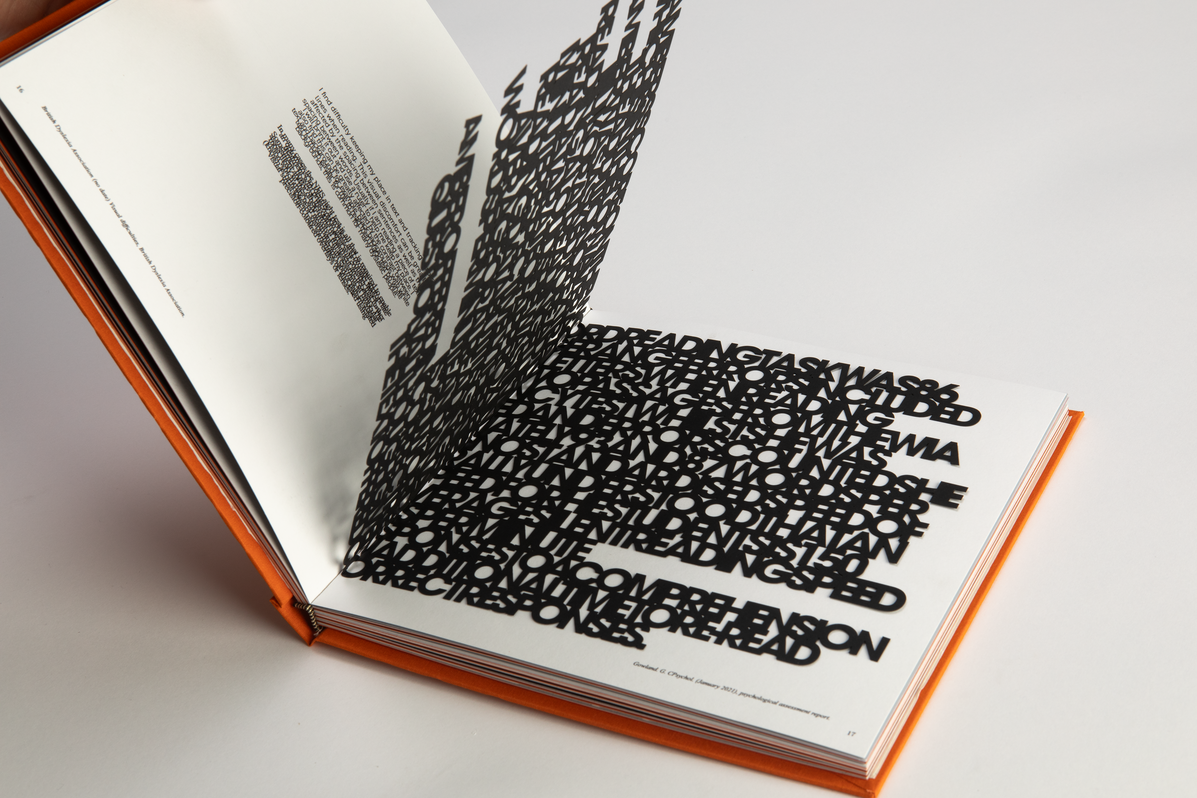
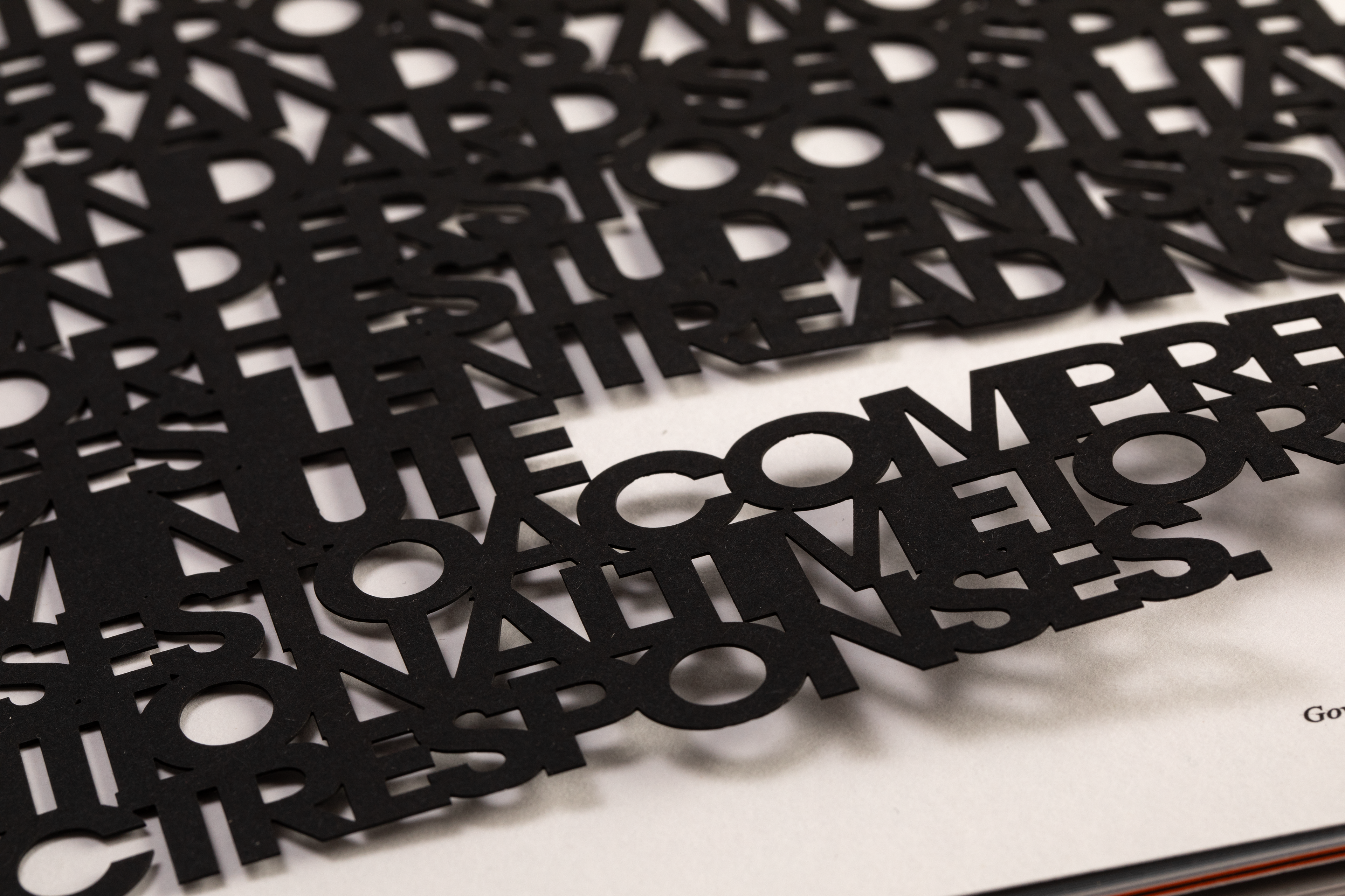
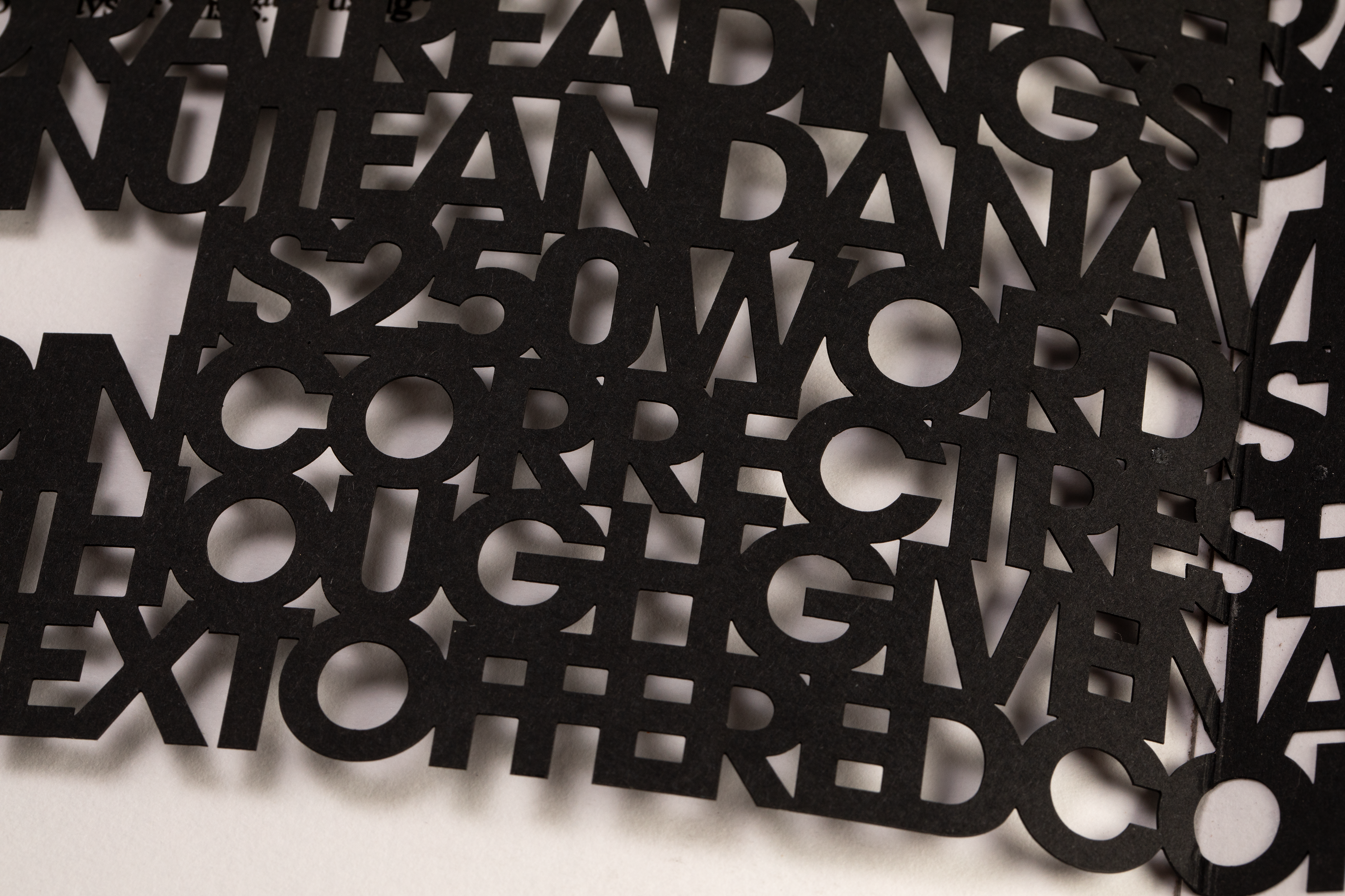
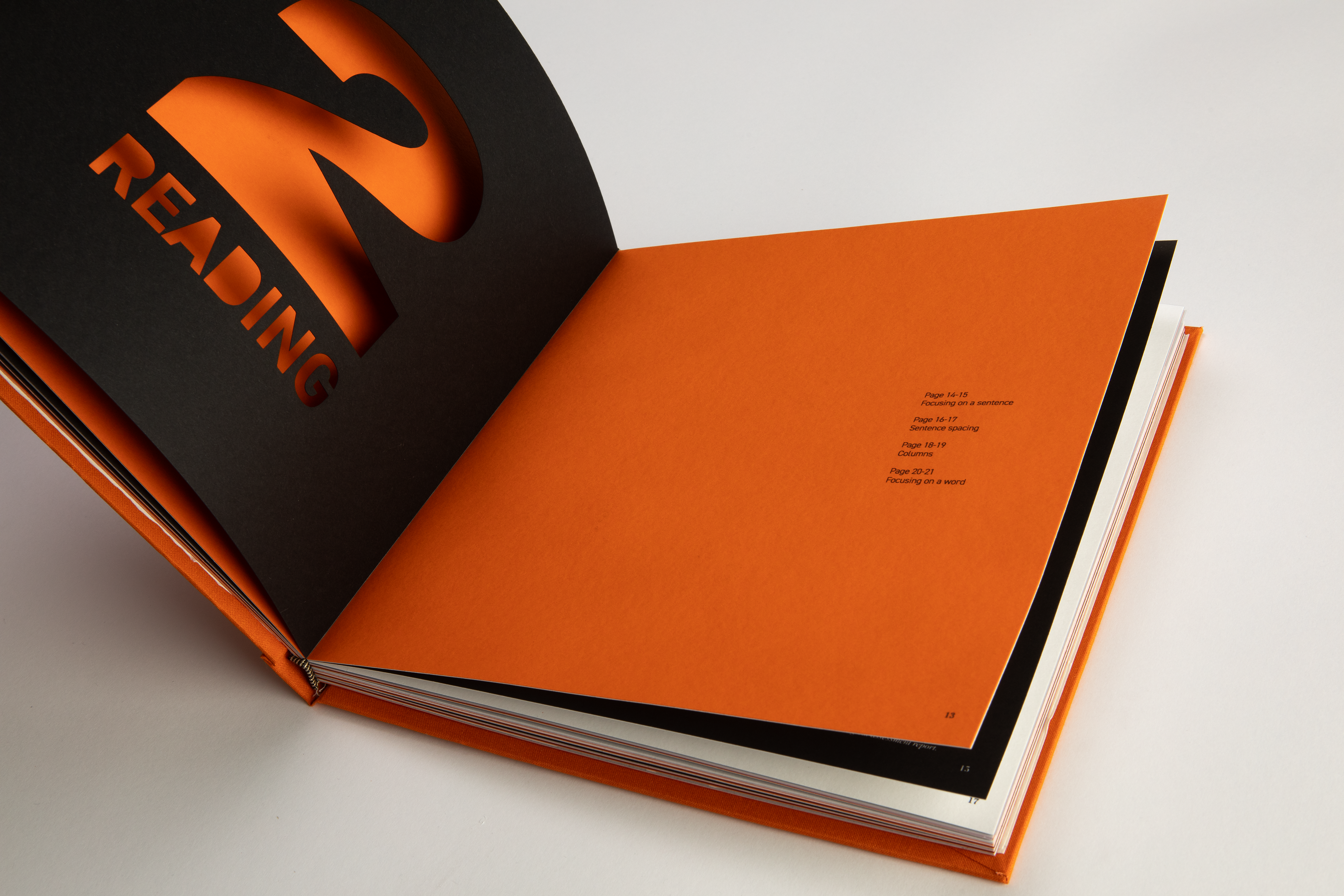
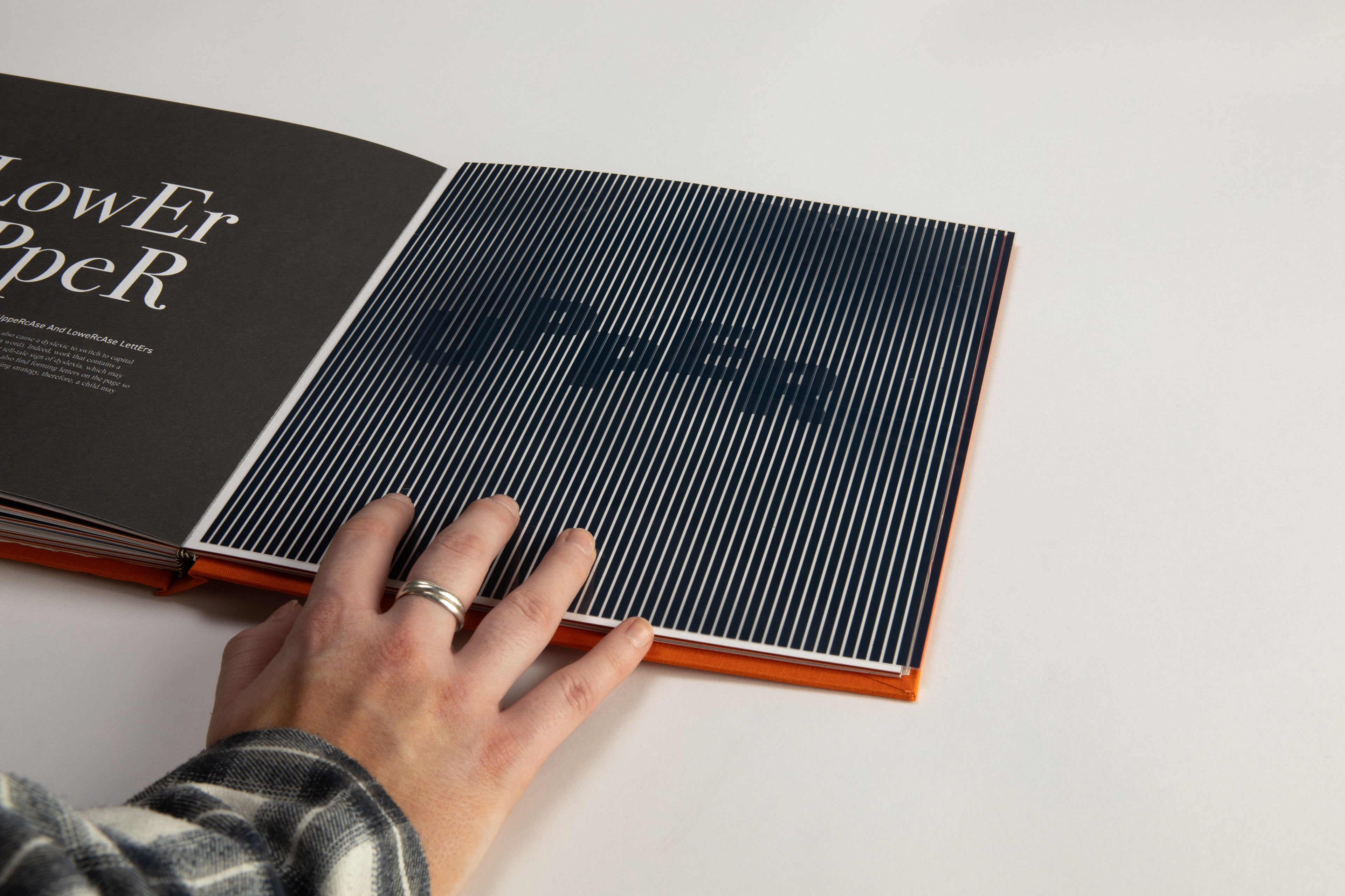
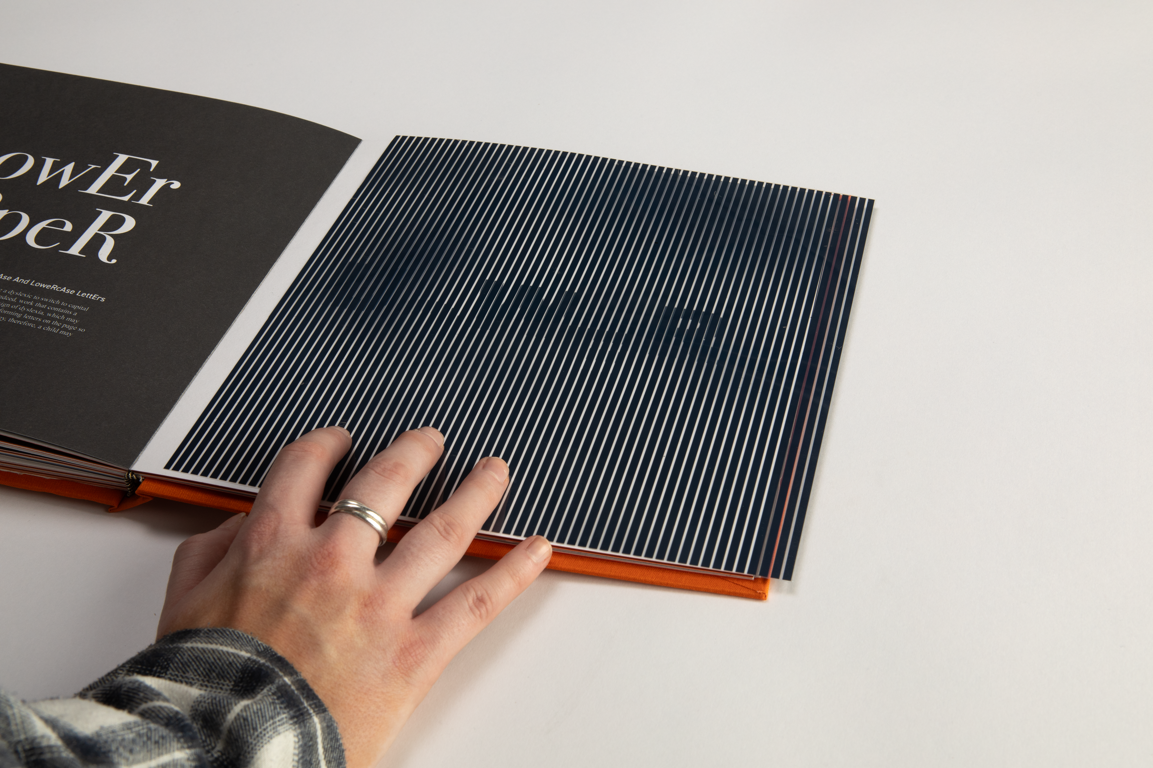
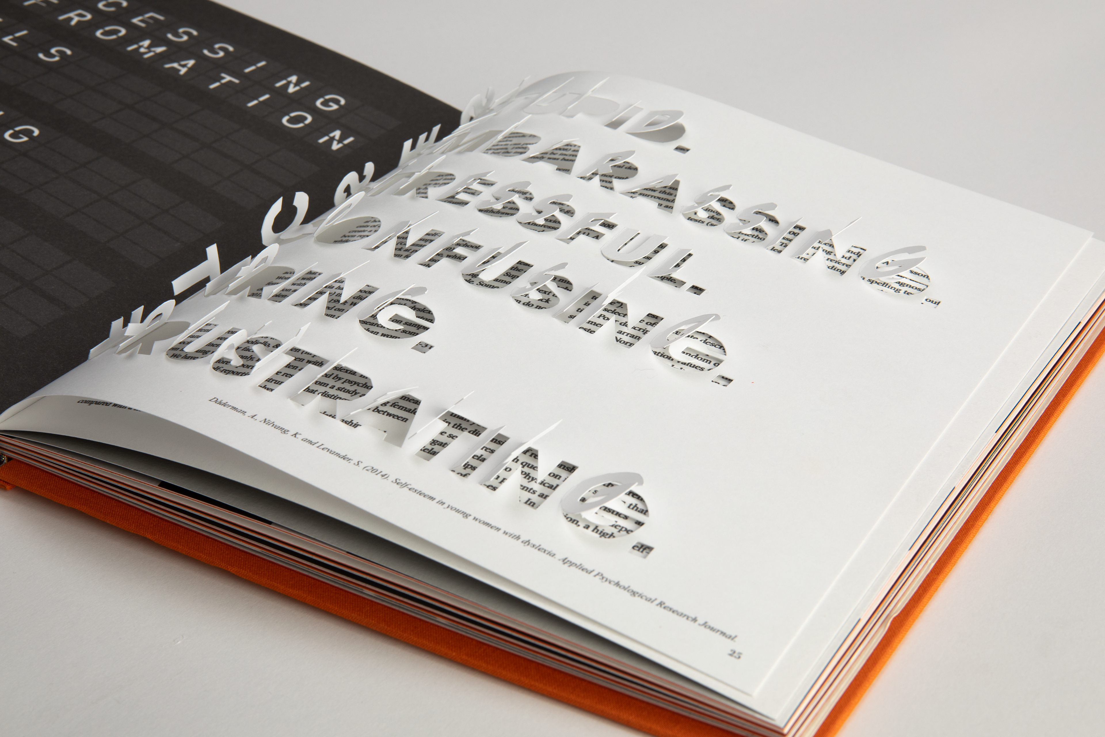
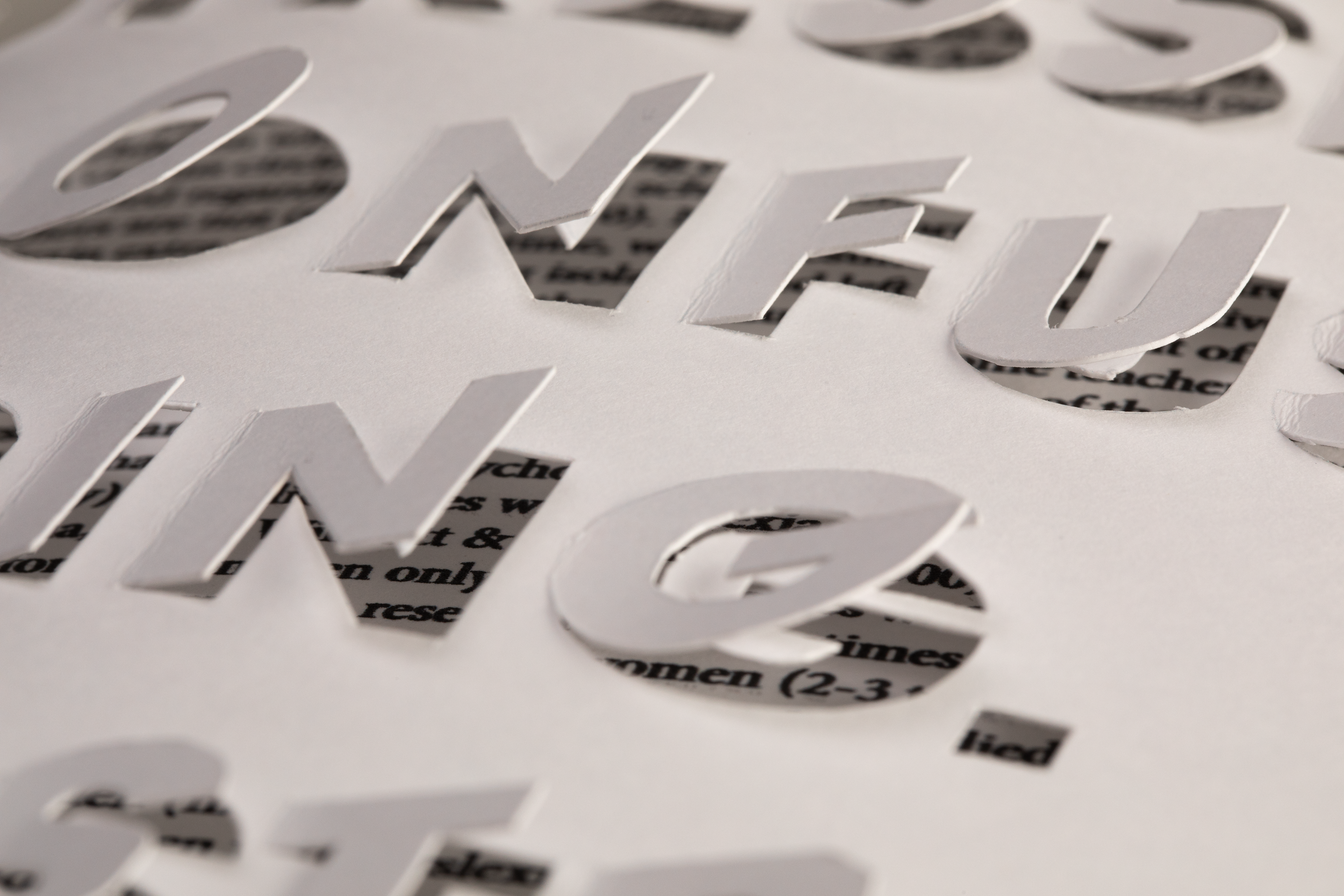
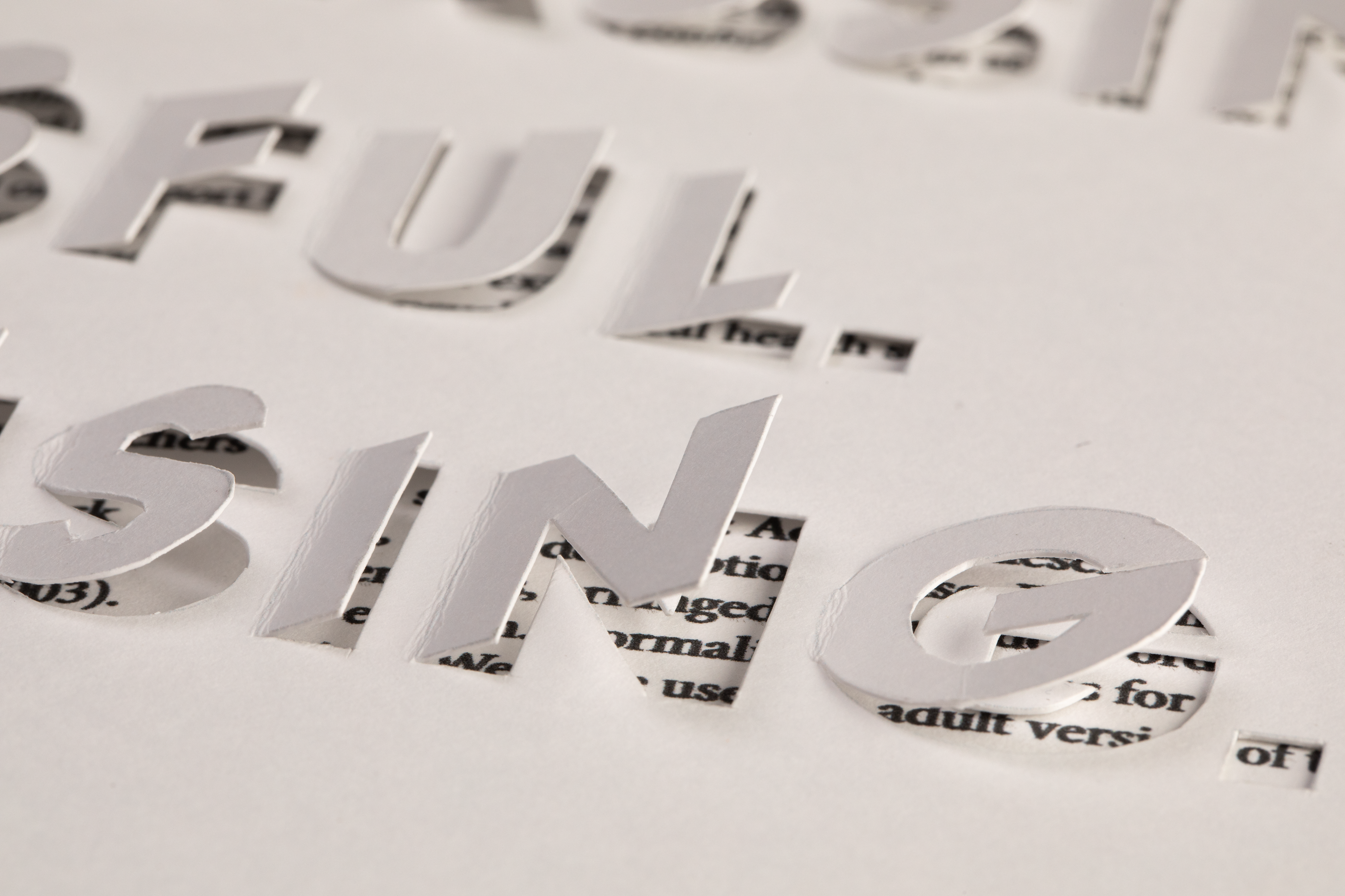
This book contains many pages with physical elements, all serving a purpose to convey an area of my dyslexia. Above, I have used the laser cutter to emphasise how sentences can easily merge into one on a page. This fold out element creates an interactive experience for the reader and therefore produces a more personal encounter for the consumer.
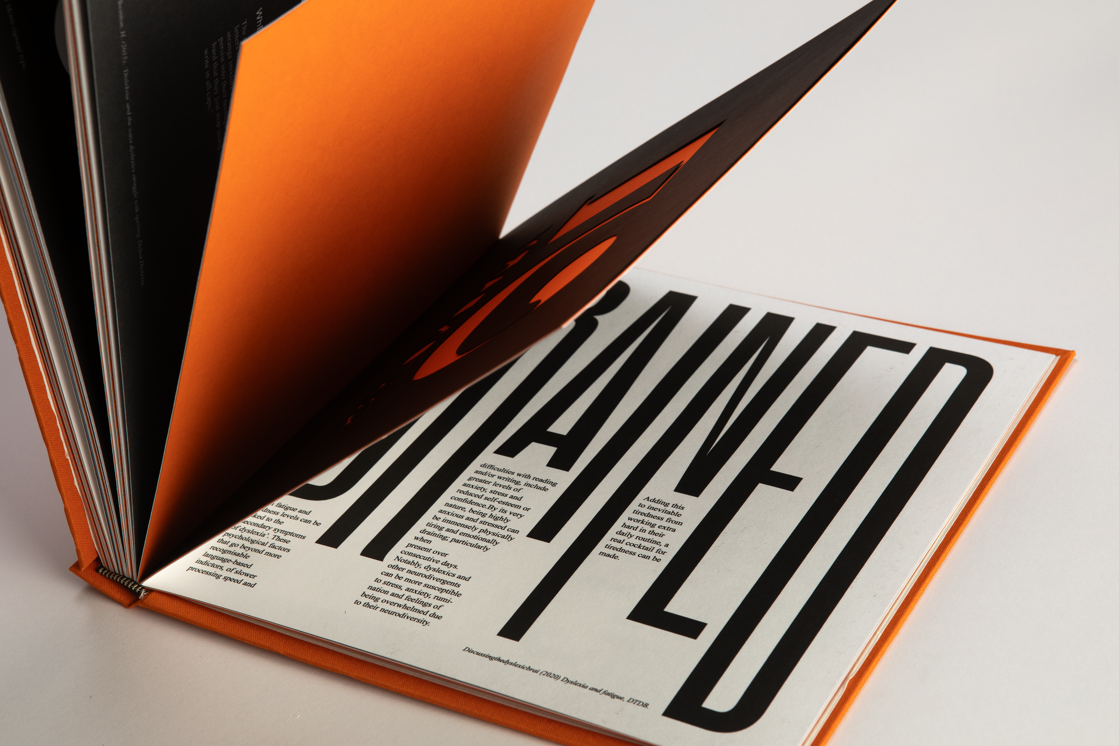
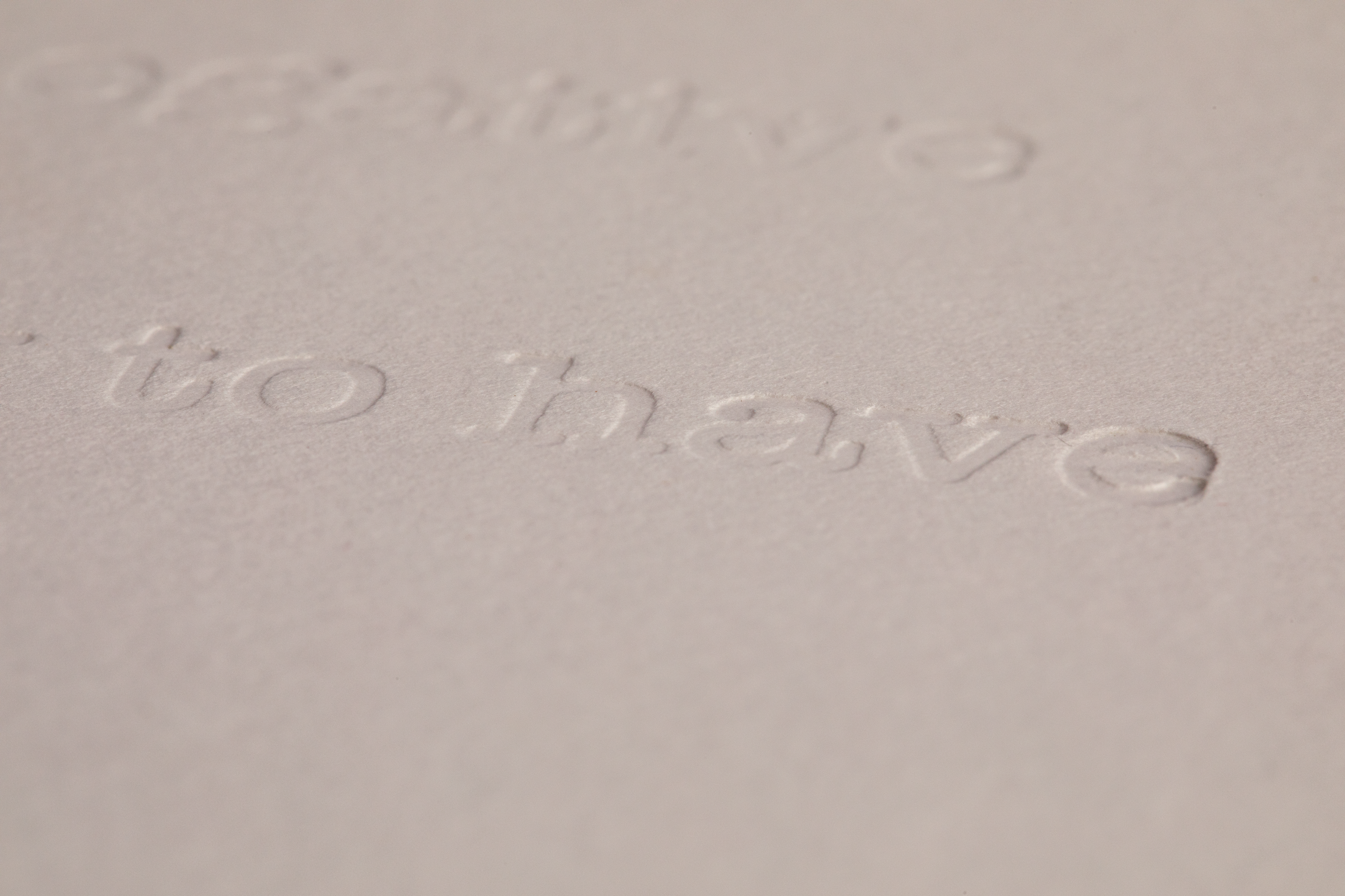
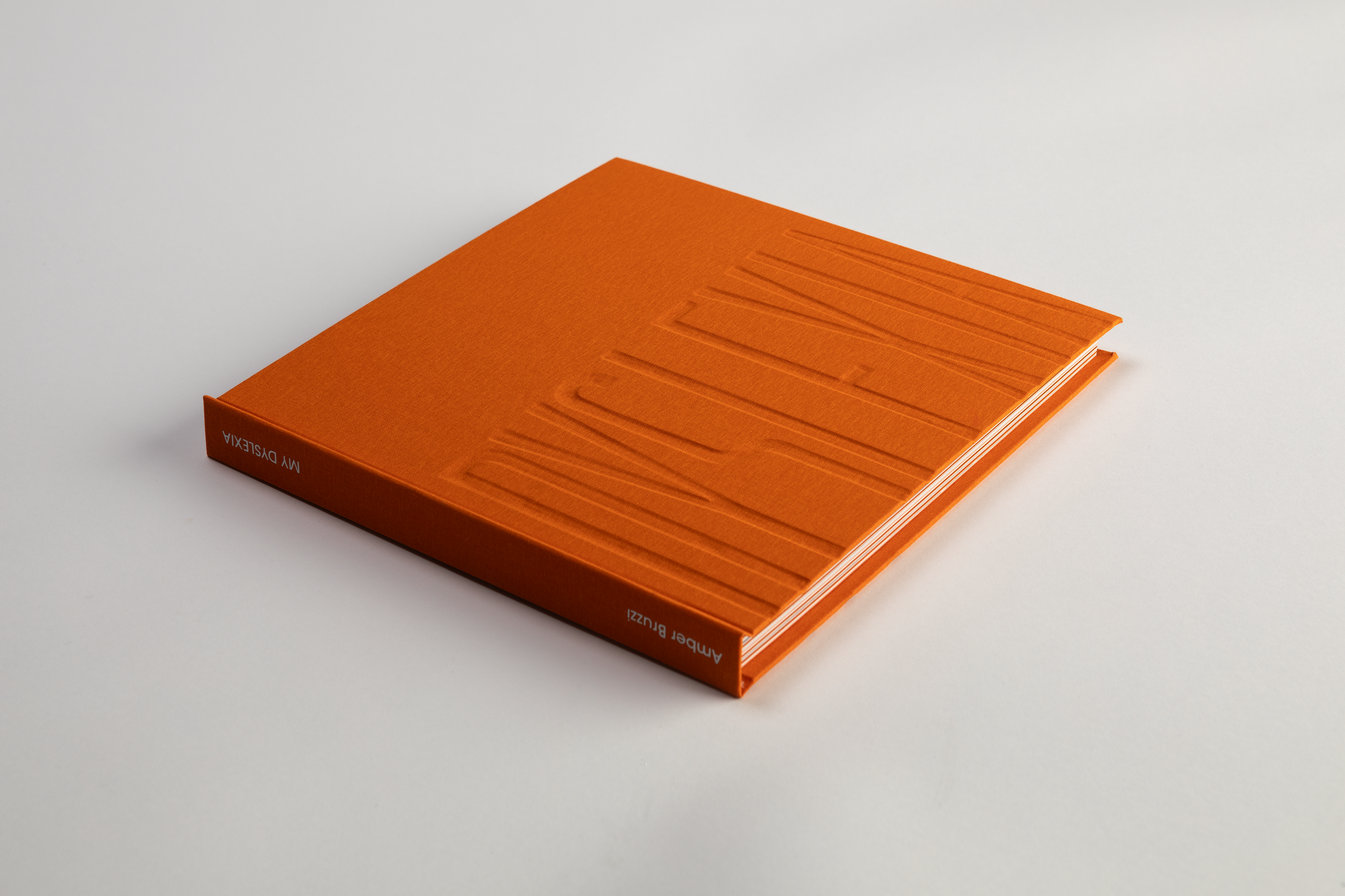
One of the physical elements I use in the book is de-bossing. This has been used to express my difficulty retaining information when reading a piece of text. The embossing was created by etching my letters onto an acrylic plate via the laser cutter and applying pressure to a page. This technique took many attempts and experiments to get right, including the amount of pressure, condition of paper, and condition of the acrylic plate.


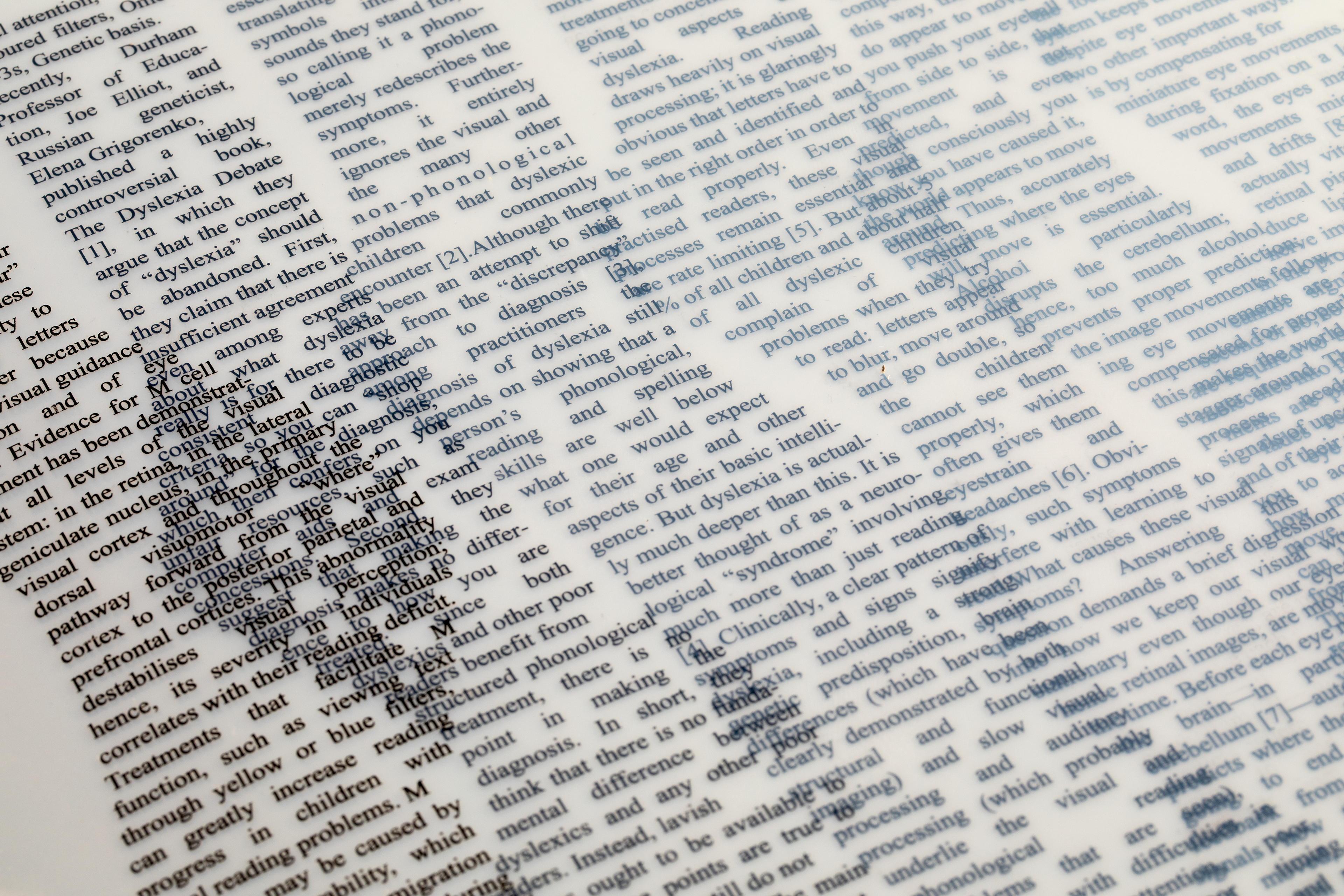
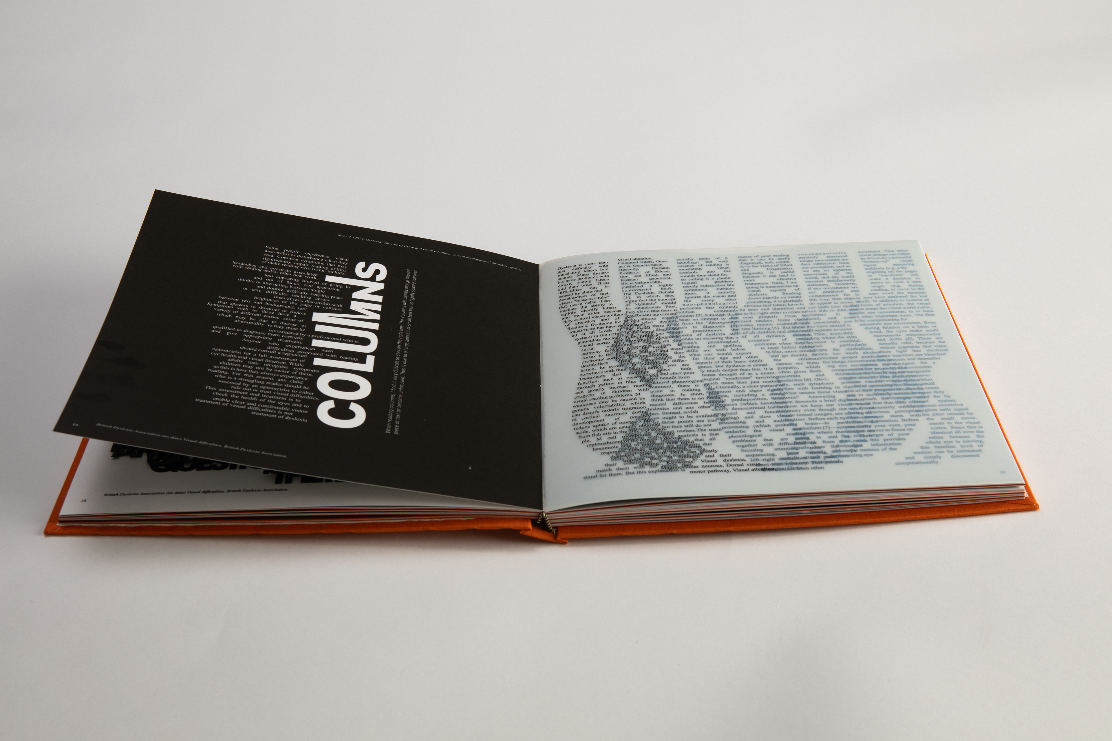
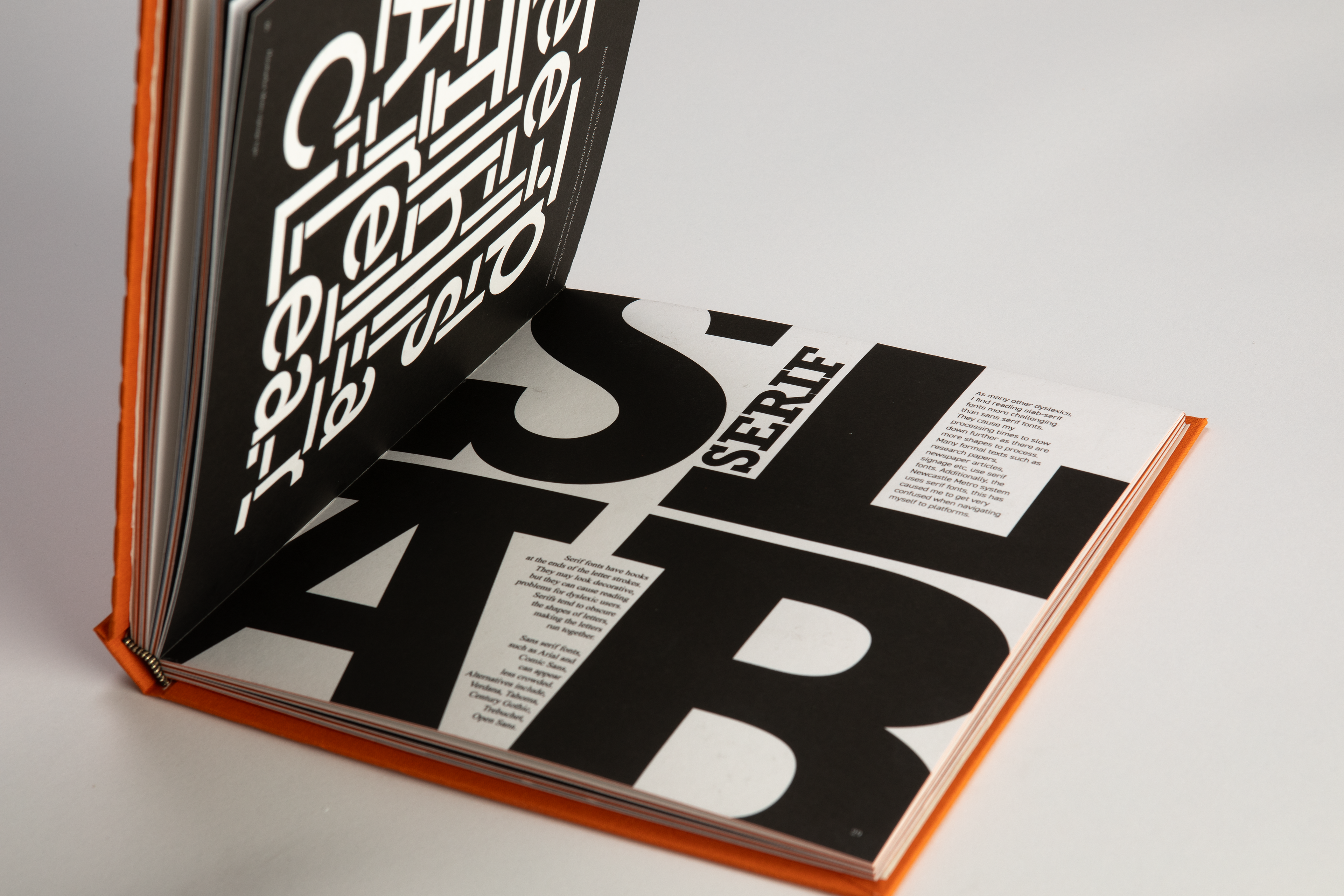
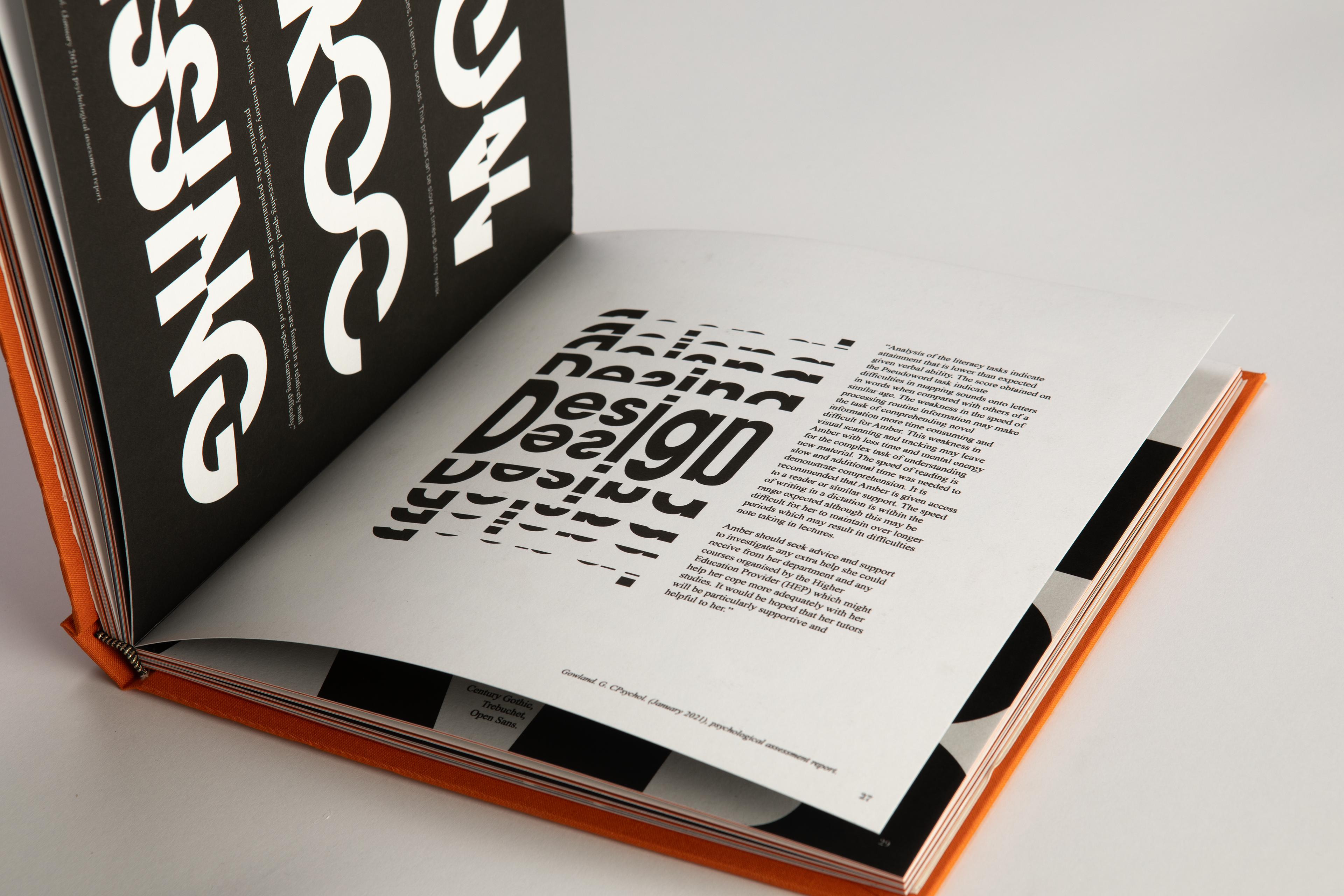
Within this book I have used many different typographic principles, including the hierarchy of type, contrasting fonts, a range of sizes, whilst also paying attention to kerning and layout design. I have used two different body copy typefaces to emphasise the difference between myself speaking to an academic piece of writing.
ADVERTISMENT
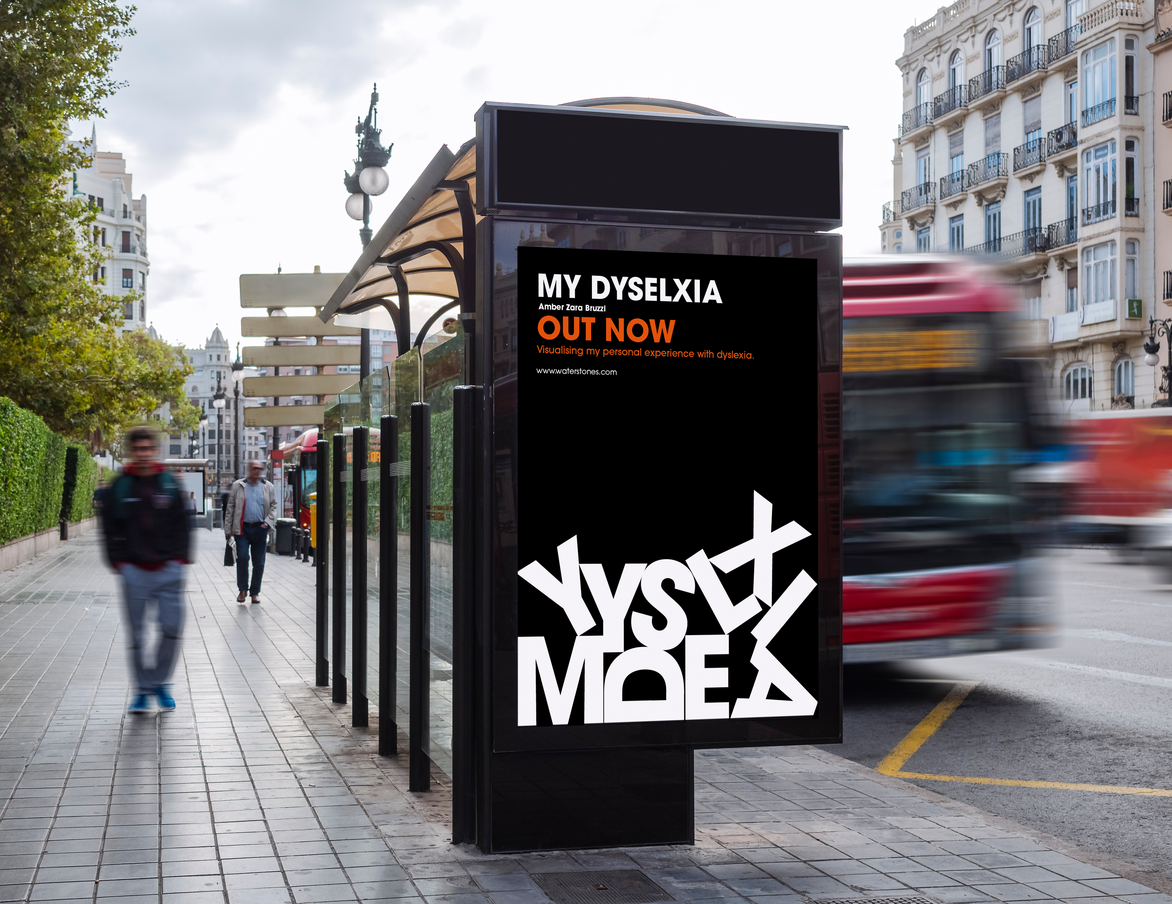
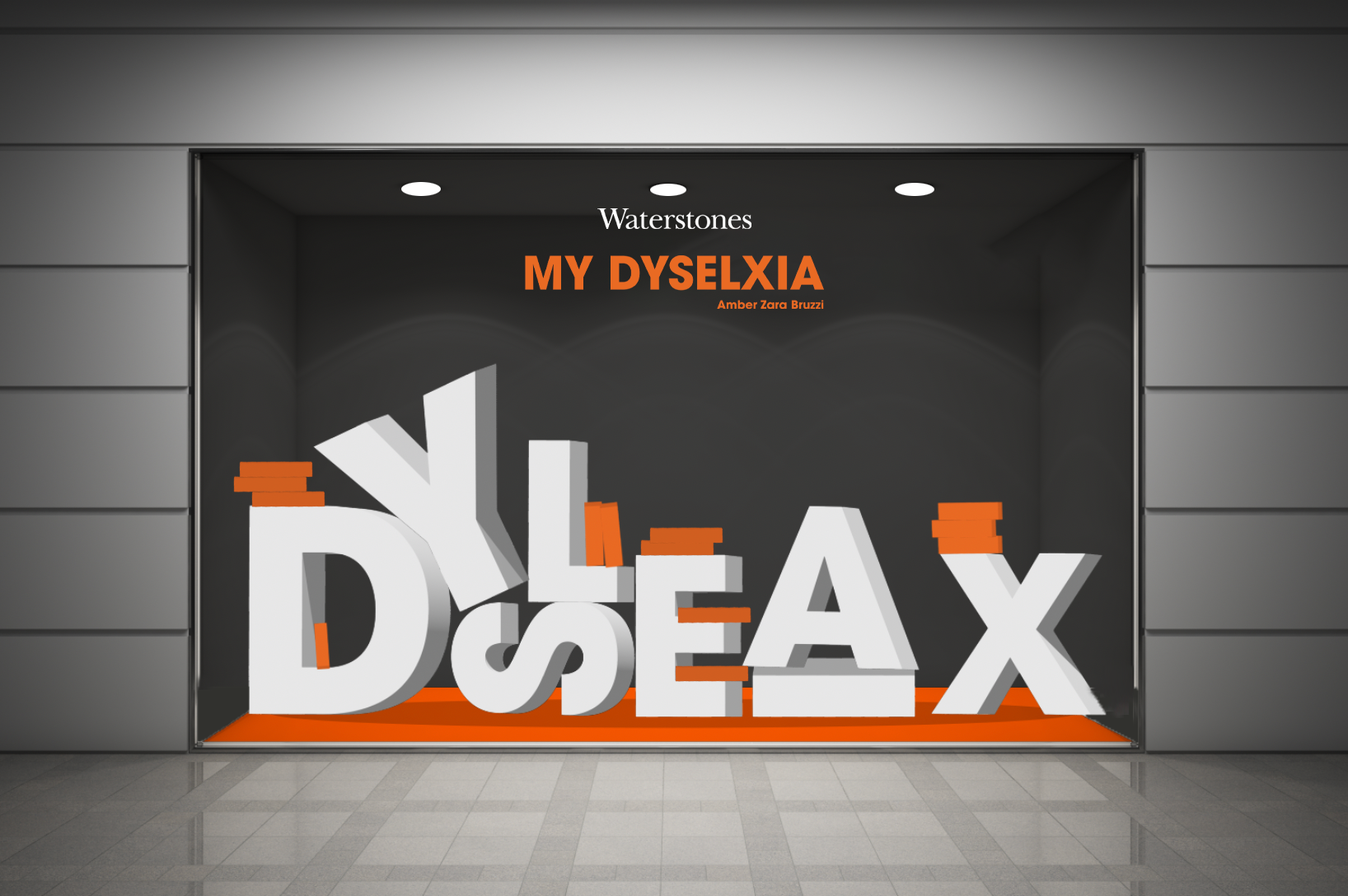
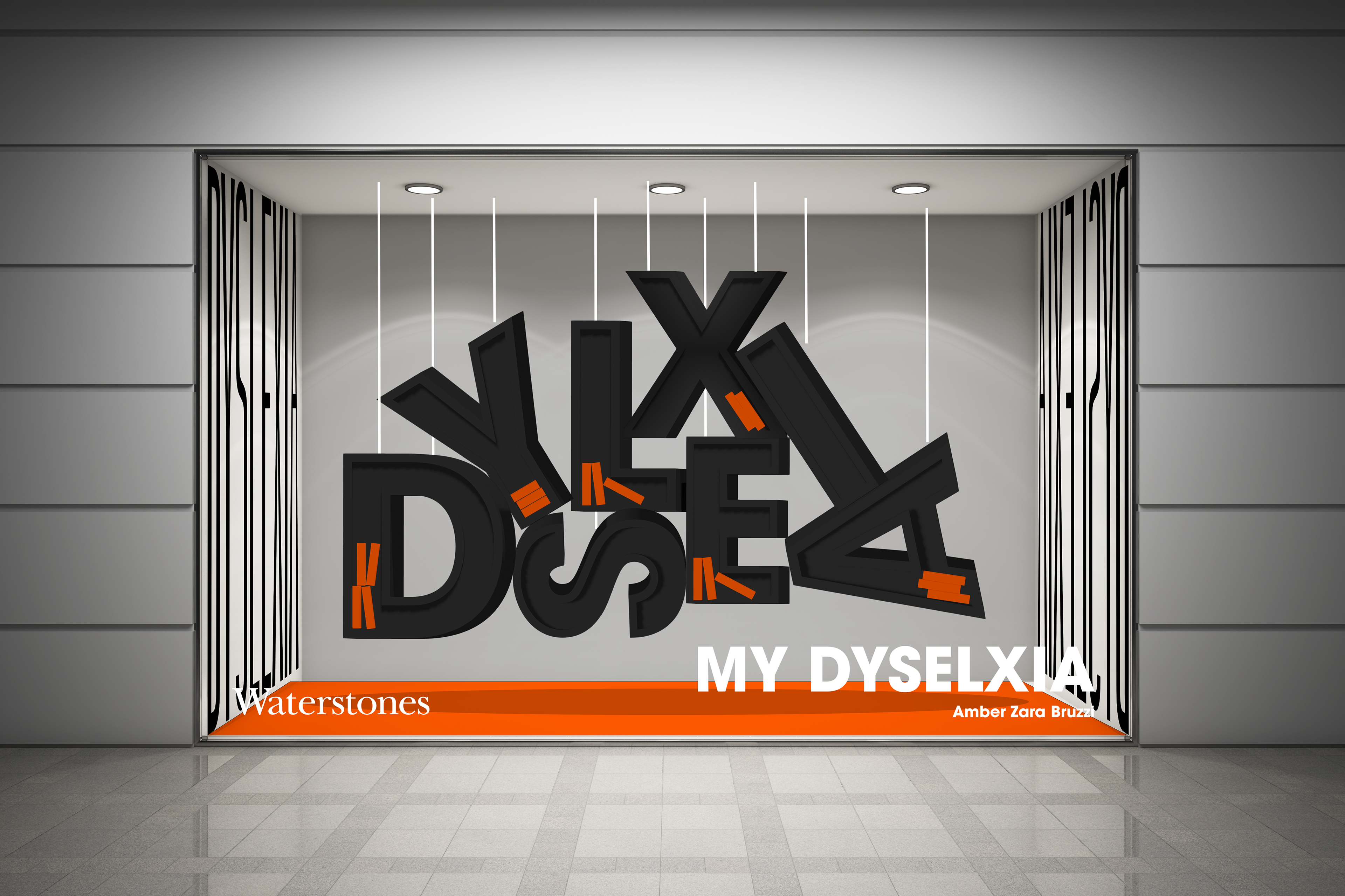
I have designed a range of different advertisement mediums including animated posters, eye catching and audience engaging posters, as well as deigning in-store layouts and window displays for retail designs.
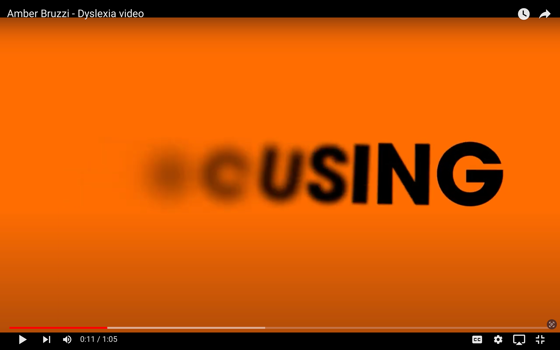
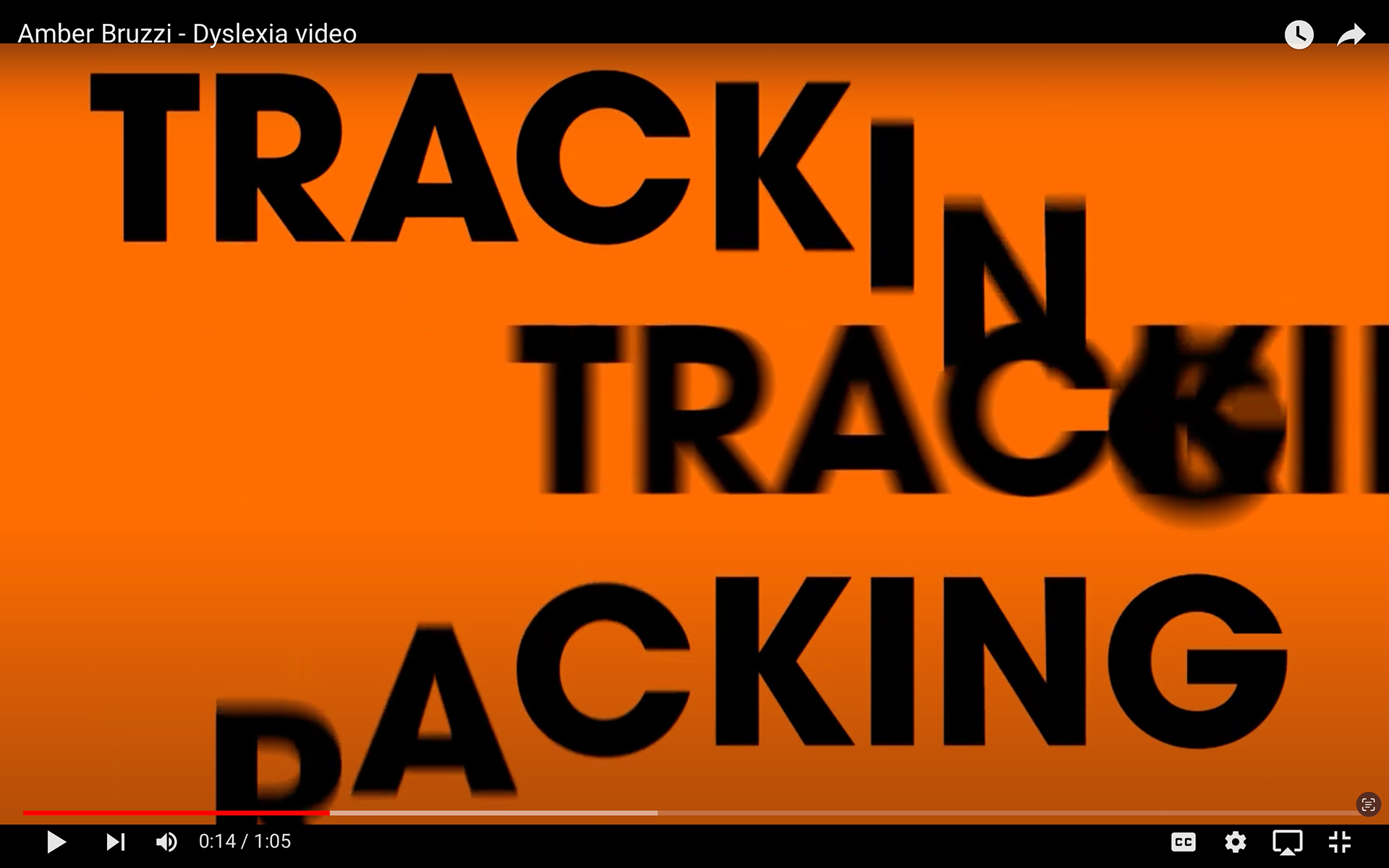
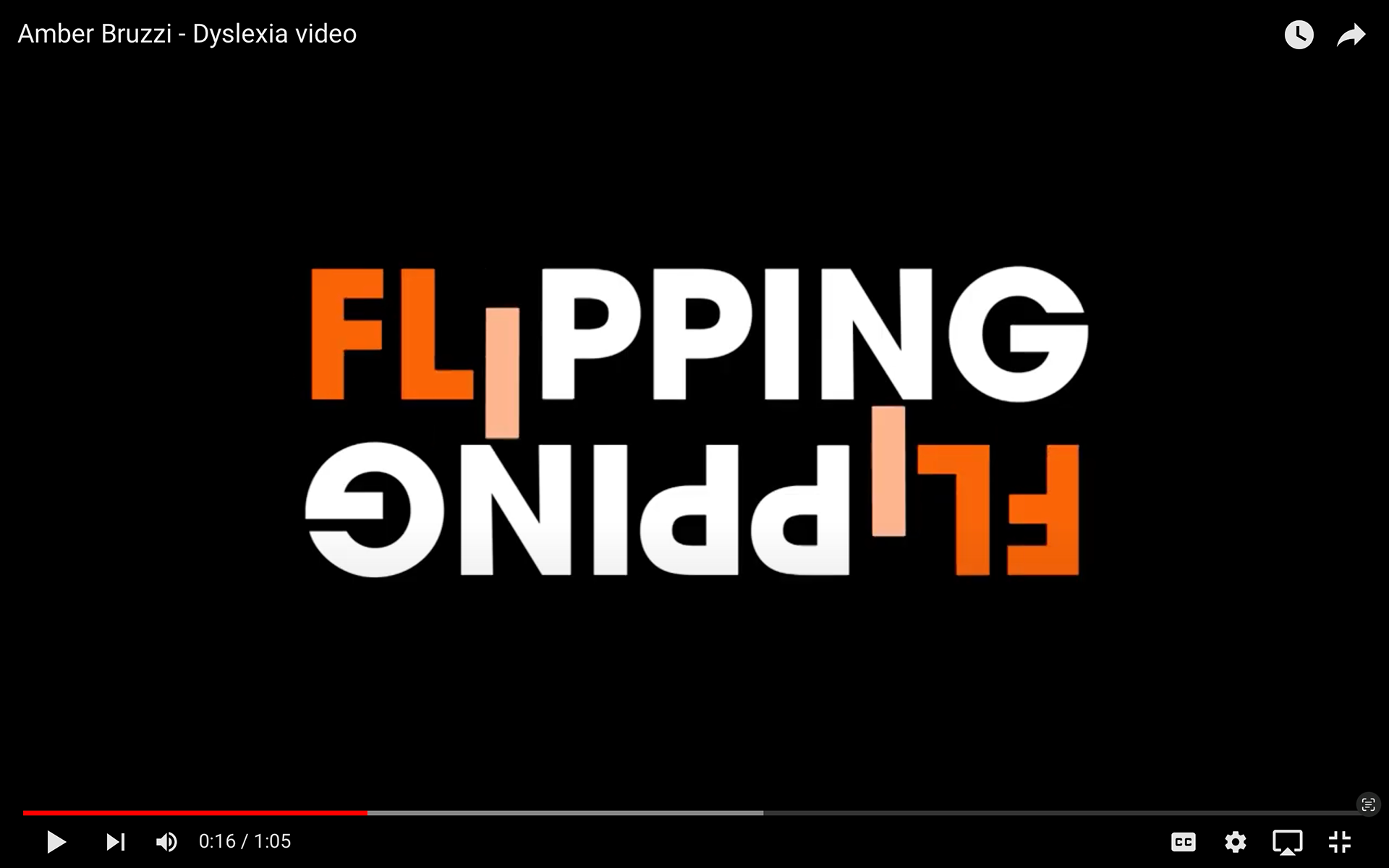
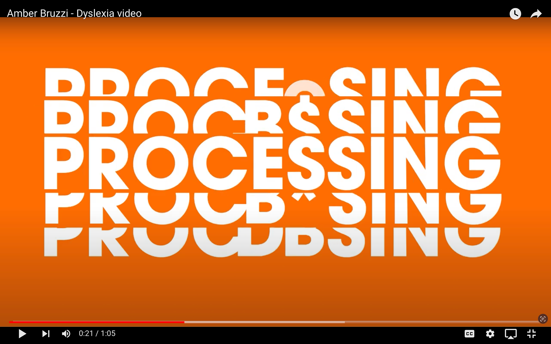
ANIMATION VIDEO
Part of this project was to create a 1-minute video explaining your project. I decided to do a typographic animation advertising my book, this helped me develop my Adobe AfterAffects skills.
Copy this link to watch more: https://youtu.be/vIm4exj-R1w